Friday 26 September 2008

Push Your Business

1_2

Following on from todays 'vintage' theme...check out the signage system employed by this turn of the century sign maker. Talk about putting your money where your mouth is. (I especially love the elephant.) Starting from this Omaha building in 1895, Renze has grown over the years to become a national leader in trade show exhibits, point-of-purchase solutions, and environmental graphics. I guess the signs worked.

Introducing the Sprightly Spearmen

4

2

2_2

3

Look what I just cane across...front cover, inside front cover, inside back cover, and back cover for a 1915 children's storybook featuring Wrigley's Doublemint chewing gum...lovely.

Wednesday 24 September 2008

Bea Szenfeld


Swedish designer Bea Szenfeld has such fun styling, love the bunnies. Her photos feel like a quirky foreign film with a love story...and maybe a murder.

Dominic Wilcox

Dominic Wilcox has created this Xylophone Bin for a VIPP Charity auction in NewYork to raise money for Chernobyl Children’s Project International and Foodbank NYC.

‘When the pedal is pressed the lid opens, releasing a ball that travels down a ‘helterskelter’ set of xylophone steps around the bin. Each time the ball hits a step, a note is played. The xylophone steps are cut in increasing lengths so that the note gets deaper as the ball gets closer to the bottom.’

There are also two videos on his site, all for a good cause and worth a watch.


Monday 22 September 2008

Geir Moseid


Some genuinely beautiful photography from London based Geir Moseid. A real attention to detail can only set him in good stead for the coming years, not to mention a solo show at the fantastic Flowers East.

Chrissie Abbott

London based illustrator Chrissie Abbott was at the Nike 1948 pop-up store last week, embellishing the first of Max Lamb’s benches he built the day before. I really like her style and bold use of colour.

www.flickr.com/ycn

Friday 19 September 2008

Tap'd NY - New York "Bottled" Water

Tapd_main

Hmmmm...here's something slightly reminiscent of a previous uni project...seems like this is the new fashion.

Tap’d NY is a new brand of bottled water where the contents are nothing more than New York City tap water. They don’t hide it, in fact, it’s part of their brand ethos:

Tap’dNY is a bottled water for the new age: an honest and local alternative for all New Yorkers. We purify and bottle New York City’s famous tap water, leaving out the malarkey and far journey included in other bottled waters.

The design of the bottle is simple and transparent, and features the pipelines reminiscent of the layered NYC skylines. The colours were chosen to be Orange and Blue, the same as those of the Flag of the City of New York. Credits for the concept and design are shared between "many people", according to Craig Zucker of Tapped Drinks.

Tapd_bridge

Tapd_downtown

Tapd_jogger

Bottles feature a variety of cheeky slogans on the back, including such gems as "Bottled Water Without the Funny Accent" and "Water Just Like Mom Used to Serve". You can see more on the website.


Jennifer Khoshbin


Jennifer Khoshbin
carves shapes in pages of books to create a new and exciting designs.

"In these experiments I am trying to delve into the books, into facts and knowledge, as a way to understand my world. Using the surface space to express what I “dig-up”.

There's a recurring theme of stacked circles that looks fascinating


Wednesday 17 September 2008

The Silent Giants

The Silient Giants have got some great work, pictured is their recent work for the band, Ra Ra Riot.

www.thesilentgiants.com/blog/

Sizes May Vary

Lawrence King Publishing consistently release good design books, one of their latest includes ‘Sizes May Vary’ by Mark Boyce. I have just been given this book as a gift, and even though I'm yet to use it, I love it! The book references the varying standardized formats and systems used within graphic design. Part sketchbook, part reference book and part notebook – it is a space for composing and visualizing layouts, sketching and developing ideas, taking reference and making note. There is also a nice hidden surprise, tucked in the back cover; a CD loaded with all the formats, and a very nice A1 poster.

www.sizesmayvary.com

Monday 15 September 2008

Sony Commercial


Foam


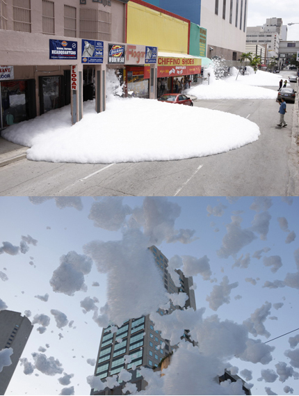
Sony commercial featuring lots of bubbles.....lots and lots!! Sony never do things by halfs, and this goes to prove that, they always produce amazing adverts with such simple concepts which have maximum effect, and that equals great advertising.

Tea Forté

5traydessert


Ribbonexotics

Infuserandcup

Tea Forté from designer Peter Hewitt. A nice combination of geometric and organic: tall polyhedral infuser packs, each with a disarmingly natural-looking leaf/sprout tag. Although the tall pyramidal shape is not a “close packing” polyhedron, the individual tea-bag/infusers do pack together in a variety of sculpturally intriguing ways...nice!

Friday 12 September 2008

Dissasembled Appliances Prints

Il_430xn36760677

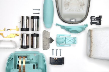
I've seen BrittnyBadger's dissasembled appliances before, and was surprisingly impressed! She now sells prints of her photographs on etsy. Above is a dust buster. Ingenious!

Effektive...


Effektiv_spirograph_posters_2

Great work from greig anderson (effektive)....have a look around his site, you won't be disappointed...

Wim Delvoye is banned from exhibiting tattooed pigs in China

Eight tattooed pigs by Wim Delvoye have been pulled before the opening of SHContemporary in Shanghai, China. The pigs were tattooed with Walt Disney characters and other symbols. There has been no official comment about the ban from the art fair organizers, but Delvoye has made his frustration known, stating, “We have collectors who've traveled to China all the way from Europe to see the pigs. They're very disappointed.''. If they had been purchased by collectors the pigs would have been slaughtered and their preserved skins sold for over $10,000 each. Delvoye went on to say that he does not understand why the ban was so “aggressive“.
Delvoye has been tattooing pigs since the 1990s. In recent years it seems that more artists are killing animals in the name of what they call art. Is it art? What are your thoughts on this? Should a line be drawn between branding animals for slaughter and consumption and tattooing and slaughtering animals in the name of art? What do you think?

Thursday 11 September 2008

Ikea Food Packaging

Pasta

Jam_2

Picture_22

International furniture powerhouse, Ikea, is famous for simple Swedish style and good value. Their packaged food products (mostly traditional Swedish foods) are also a study in utter simplicity and straightforwardness. I really like the bold characters of the font, and the accents make the type look extra special without looking frilly or too busy.

Designed by Stockholm Design Lab.

Bubble Calendar


I was just sent a link to this Bubble Calendar. Irresistible. It's kind of hard not to try and pop it through my screen. Can't help but think it could look a bit 'nicer', for want of a better word...don't you think?

Doorways

1

2

3

4

Modern doors for modern houses. Located in Norther Italy, door manufacturer Oikos produces a collection of contemporary doors that are clean, minimalistic, and striking.


Wednesday 10 September 2008

Graham Rawle's Oz

2

3

4

5

For his soon-to-be-released illustrated book of The Wizard of Oz, collage artist Graham Rawle created and photographed elaborate sets and characters as 1:6 scale 3-D models. True to the original book, the scenes include many not depicted in the famous 1939 movie. And, of course, the slippers are not ruby. Like the movie, however, there's an otherworldly feel to these images. Fun, imaginative, and just a little bit creepy. Check out more of Rawle's pictures, including some "making of" shots, here.

Which kind of Obama supporter are you?


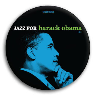
These Obama pins are genius. Find many, many more here.